Grazziella Wilson on the 5 big tile trends you need to know about now
Grazziella Wilson on the 5 big tile trends you need to know about now
Ca' Pietra's marketing director and head of creative Grazziella Wilson presents the 5 key tile trends that are going to set the tone in kitchen and bathroom interiors over the coming year.
Our Trend Reports at Ca' Pietra are an analytical read of all sorts – our very own business data and buying behaviour (so we can present trends that we know will resonate with what our customers know and love), what’s happening in fashion, the hottest hospitality openings and what they’ve done to cause a creative stir, what the UK's leading trend-forecasting agencies are preaching (colour experts, Google Trends, META, Pinterest reports – the lot), plus a hearty dose of what we have going on in our own heads (because our curious minds never switch off at Casa Ca’ Pietra). We notice the unexpected, we follow every market move, we balance the creative with the commercial, and we use all that to create a completely tailored compendium of trends that we know will set hearts aflutter within the Ca’ Pietra community.
Want to see what 2025’s got in store? Here are THE BIG 5 tile trend predictions:
1. New Classics
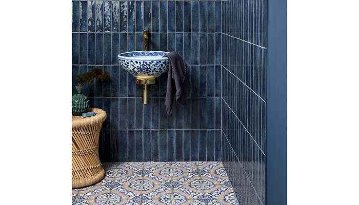
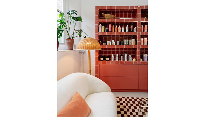
As WWD put it: “The collections presented in Milan [fashion week] were all about earthy tones.” Your coffee browns from milky latte to long black, those terracotta tones that warm up a room in a nanosecond, and even more pigmented colours like deep blue that takes its cue from ocean depths. 2025 is about investing in classic colours but taking them down a richer route to before. They’ll anchor any space in a heartbeat and will have you nailing a trend but also putting down roots because that's the best thing about classics – they just don’t ever date.
2. Art of Artisanal
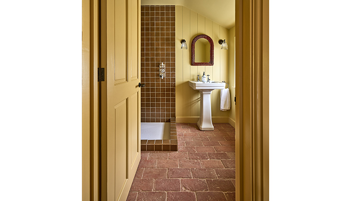
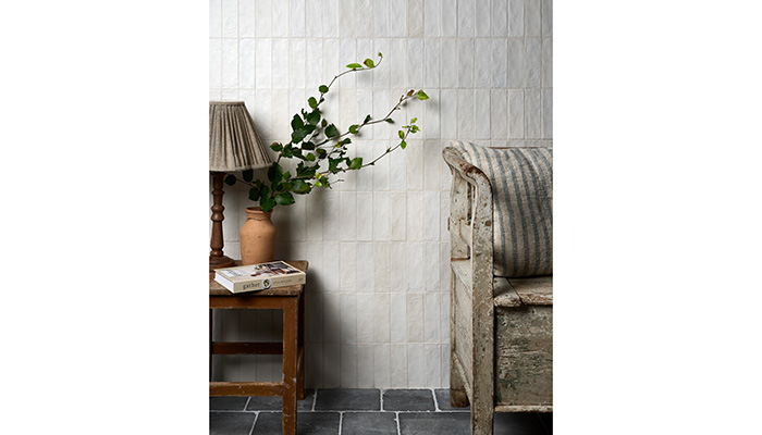
Talking about things not dating – can you ever imagine appreciating artisanship being a thing the world stops doing? Thought not. Our second trend-to-watch for 2025 taps into the love of all things beautifully crafted but really throws that detail under the microscope to celebrate it properly. In tile speak, that translates as tiles that emulate hand-drawn detailing or that have deliberately imperfect finishes. Bona fide artisan tiles carved from natural stone with tumbled edges and mottled markings from their traditional making process sure, but this trend can still be achieved with ceramic and porcelain tiles. Expect plenty more of our exclusive Artist in Residence collabs in the next 12 months too where hand-illustrated markings from nature to travel-inspired detail abounds.
3. Revival
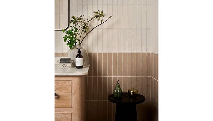
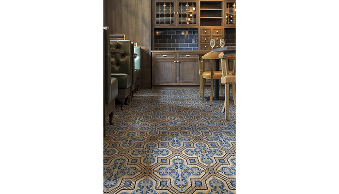
Throw. Back. To when? Whenever – the revival trend isn’t strict on eras and welcomes any form of hurrah to tiles inspired by their heyday. The point is more about enjoying the finer details that traditional tiles capture and then bringing them bang up to date in more modern homes. Chequerboard floors and those studded with octagons and cabochons? You got it. Age-old Moroccan Zellige and Bejemat designs? Absolutely. And reclaimed tiles that cover off industrial revolution warehouse references or that dusted stone look that speaks to uncovered majestic tiling in heritage buildings across the globe? Coming right up.
4. Soothing Minimalism
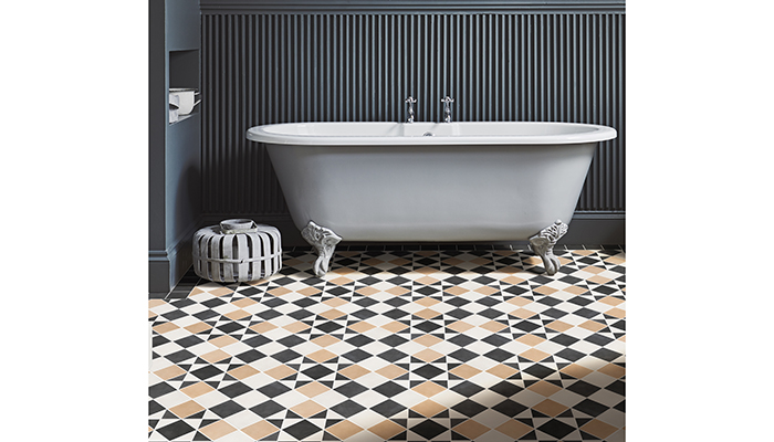
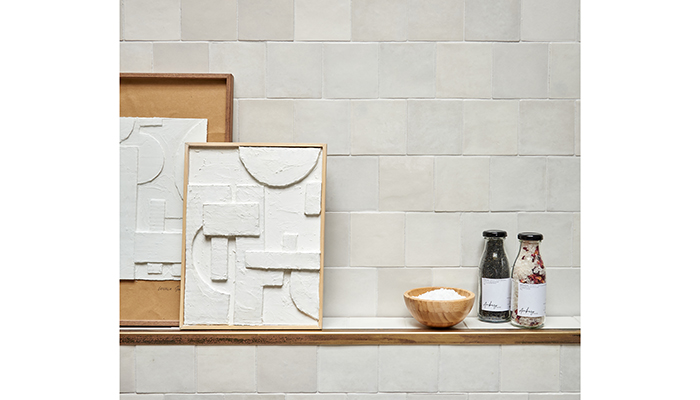
We’ve done rich, we’ve done deep, but now it’s time to dial down the colour and turn up the texture. Soothing Minimalism will see you layering calming tones and creating visual texture to help your client rest and reset in their home. Those taking trend notes, scribble down natural materials and cold whites dialled up and let those be your northern star. Let matte and satin finishes live side by side and watch what their textural interplay does to your design, and don’t be afraid to mix things up – soft white matchstick tiles and velvet-soft XL limestone tiles go together just as well as gin and tonic.
5. Tile Talking Point
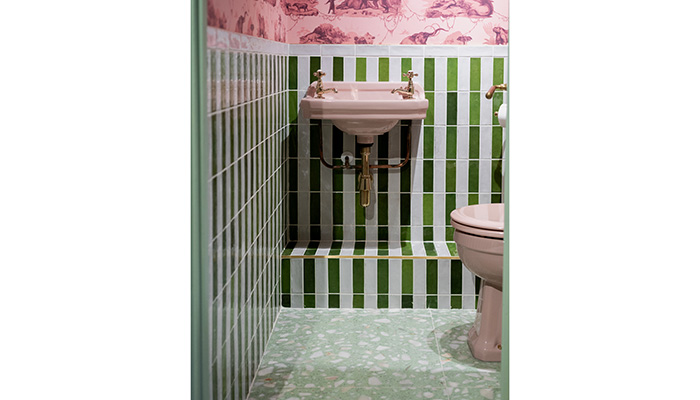
Last up, we flip back to colour. Serious colour. The tones that spark joy and boost your mind and those tiles that grab the eye, hold it, and have you looking back for more. These are the tiles that want to be talked about, causing a stir every single day. They could be tiles with a less-than-usual shape like arabesque or picket tiles; they could be stand-out shades like jade green, azure blue or a mega mustard; or they could be unexpected mix and match tiles like pinstripes aside florals that shouldn’t work but really, really do. To end on another quote: “We’re not looking to anyone for permission on how we use colour anymore.” And who are we to argue with Elle Decoration?
Tags: insight, features, grazziella wilson, ca' pietra, 2025 tile trends, kitchens, bathrooms


