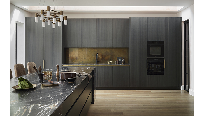
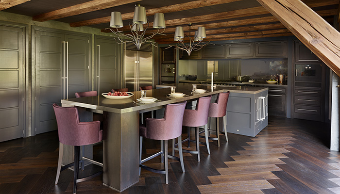
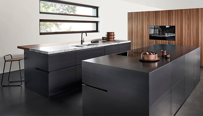
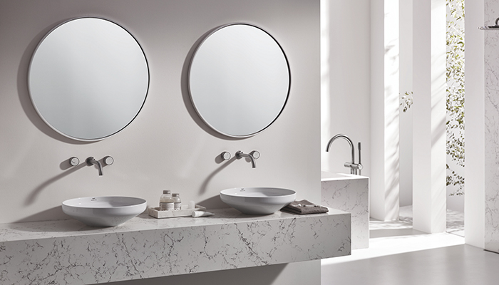
From soot black cabinets to slate-inspired surfaces, dark tones are proving an increasingly popular choice – Lisa Hibberd speaks to those in the know to shed some light on the surge in demand for dark kitchens.
“The recent surge in the popularity of dark kitchens can be attributed to their sleek, sophisticated aesthetic, which provides a bold and contemporary look,” suggests Ross Stewart, UK senior sales manager for Neolith. “The rise of open-plan living spaces also plays a role, as dark kitchens can serve as a striking focal point within larger, more cohesive home designs. An effective dark room really depends on contrast in order to work well and often in a kitchen setting this can involve something as simple as cleverly positioned plants and foliage, furniture in bright accent colours or something boldly different like an exposed brick wall.”
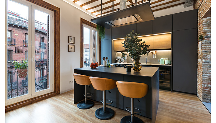
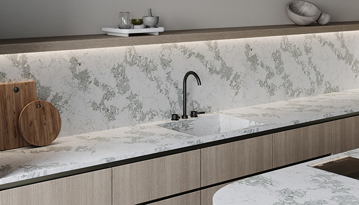
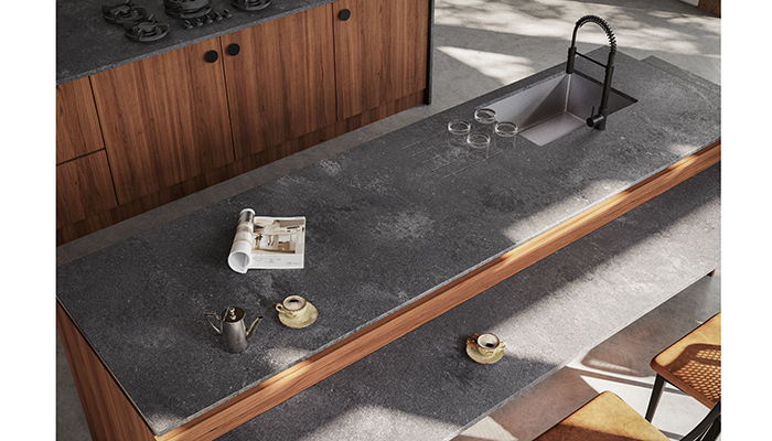
VP of marketing for Caesarstone, Jonathan Stanley, reveals that the move towards dark tones in the kitchen extends to surfaces too. “We have all become much more design conscious and as our knowledge grows, and the places in which we find inspiration expand, so we become bolder with our choices. Design publications and social media are fuelling this education and it’s simply easier to see a broader array of options and ideas. While there will always be trends, we don’t necessarily all want the same. Plain white or speckled and mirror chip worktops are becoming old hat. Marble motifs remain the primary trend, but design savvy consumers are moving towards dark greys and blacks in matt finishes with bold textures and organic patterns.”
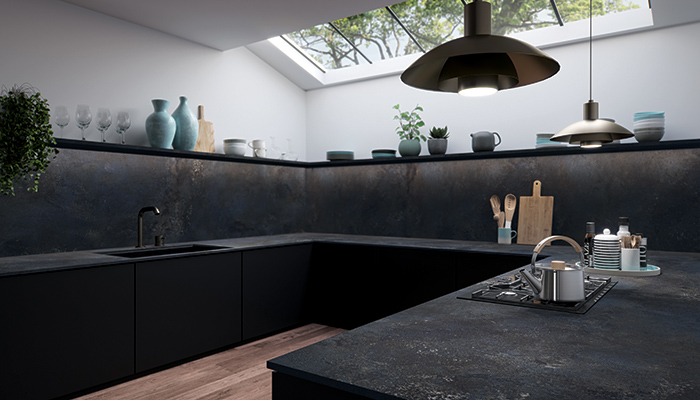
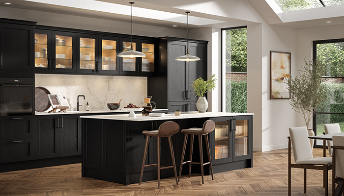
“Although dark colours can make a stylish statement in the kitchen, there are a few things to watch out for,” says Simon Boocock, MD at CRL Stone. “They can make small spaces feel even smaller, so it’s often best to use dark colours strategically and add complementary accents to enhance the overall look and feel of the space, and avoid a gloomy vibe. Dark tones can be combined with lighter elements and materials to create a balanced and visually appealing atmosphere, and keep the space from feeling too heavy or overwhelming. Dark surfaces can also show smudges and dust more easily, meaning more frequent cleaning.”
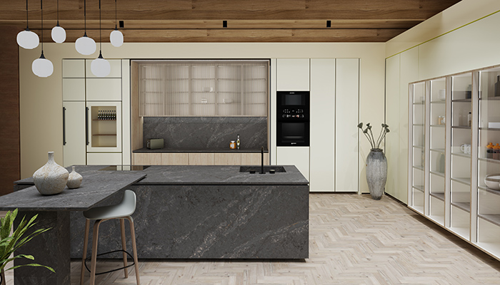
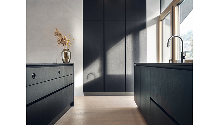
Retailers and designers should focus on a few key aspects when working with dark kitchens, recommends Sinead Trainor, kitchen category manager at LochAnna Kitchens. “Lighting is paramount – both natural and artificial light sources need to be strategically placed to prevent the space from feeling too dark. It's also possible to balance dark cabinetry and surfaces with contrasting elements such as lighter countertops, backsplashes, or flooring to create visual interest and prevent monotony. Additionally, selecting high-quality materials that reflect light, such as glossy finishes or metallic accents, can enhance the overall ambience. Functionality shouldn't be overlooked; practical considerations like easy-to-clean surfaces and durable finishes are just as important in dark kitchens as in any other design.
"Retailers should create displays that highlight the versatility and elegance of a dark-coloured kitchen. It's beneficial to set up vignettes with ample lighting to demonstrate how well dark kitchens can look under various lighting conditions. Incorporating a mix of textures and finishes, such as matte and glossy surfaces or wood and metal elements, can show potential customers the range of possibilities within a dark kitchen design. Additionally, pairing dark cabinetry with striking hardware, like brass or chrome handles, can add a touch of luxury and draw attention to the details. Retailers should also use high-quality photography and visual storytelling in their marketing materials to capture the full impact of dark kitchen designs.”
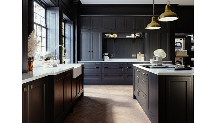
Allison Lynch, senior designer at Roundhouse and head of the Cambridge showroom, suggests the importance of retailers showcasing dark kitchens to maximum effect. “They photograph well so anything put into the kitchen will elevate it and look smart, luxurious, pristine styling and any feature walls will stand out – wallpaper, brick and wooden beams. It’s all about personality and character which people love, so this helps to ease a client into choosing a darker colour. They feel confident to take the plunge, having seen it in a display or kitchen editorials. I believe it’s best to showcase dark kitchens of different styles too. – that way it’s not just seen as a modern trend and it also works extremely well in Shaker-style kitchens making it look timeless. It also invites the client to look at all the other parts of the room, from lighting to handles, to appliances and stools/chairs and soft furnishings, because all those things pull the look together and they feel they have confidence in purchasing pieces that will help bring it to life and use inherited pieces too. Not everything needs to be shiny and new!”
