How Halcyon Interiors kept things simple to create a sense of drama
How Halcyon Interiors kept things simple to create a sense of drama
When a client asks for a dramatic scheme, sometimes less is more – Halycon Interiors' design manager Graham Robinson reveals how creating an impact does not necessarily mean overwhelming a space with stylish elements.
Q: What type of property was it in and who was the project for?
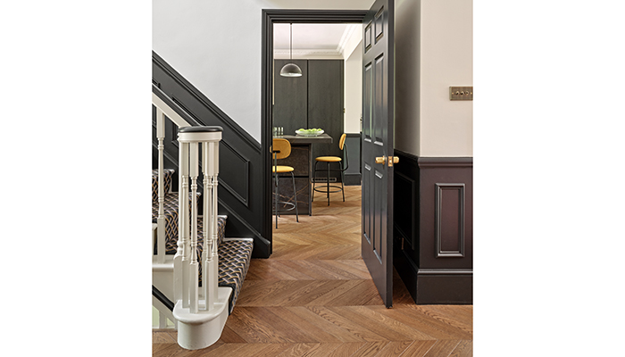
A: The kitchen was for a large home – a relatively new one that was built in a Georgian style, and with great proportions. This is the second kitchen we have designed for these clients – they are a professional couple, one half of which runs Rivela interiors. And of course not forgetting their Jack Russell, Rossi.
Q: What was the brief from the client for this project?
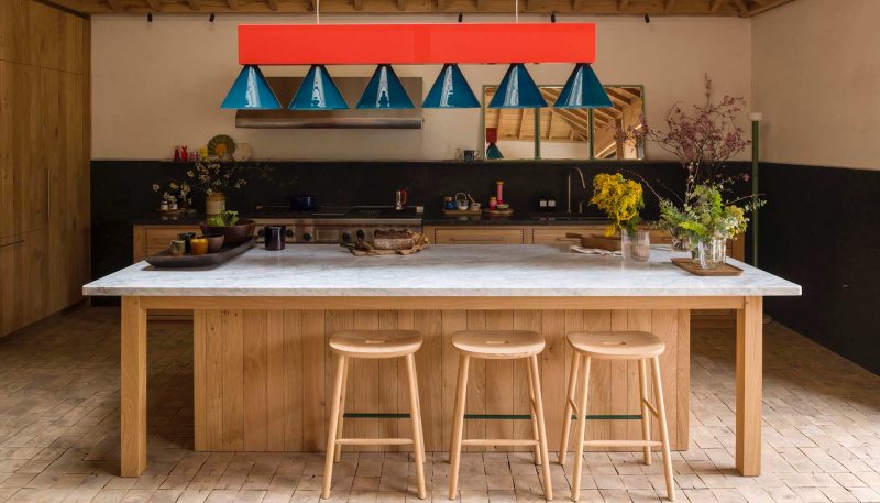
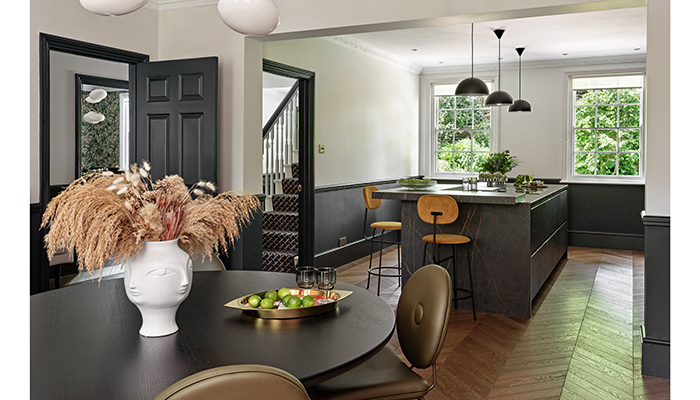
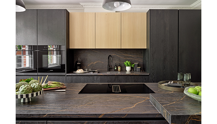
A: We were tasked with creating a dramatic, but above all social kitchen, that held its own in a grand building. We incorporated a large island as it was something they had always wanted but had not had the space for in their previous project. As the wall to the adjoining room was coming down, the whole space was part of the breakfast/reception room, so the kitchen needed to be able to cater for every scenario.
Q: How did you go about meeting the brief?
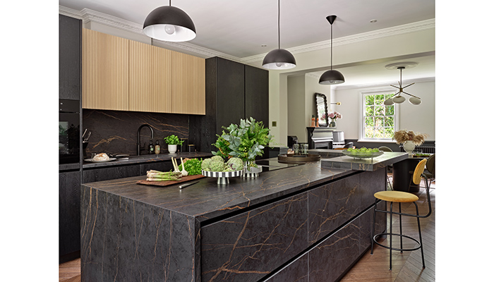
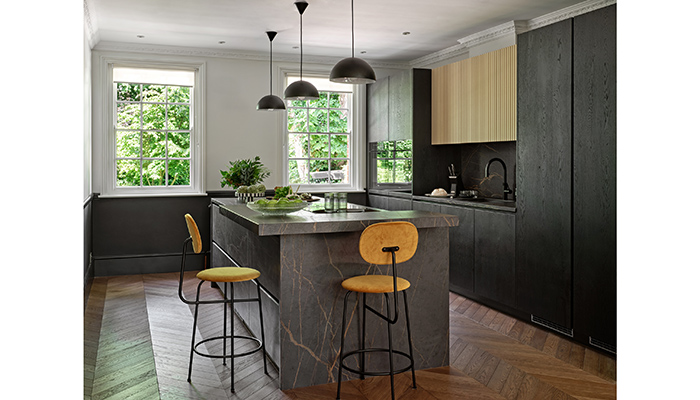
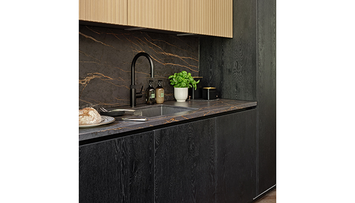
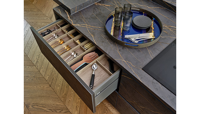
A: We kept things simple and used a mixture of textures in strong colours. The island was a key part of the design and is fully clad in St Laurent Dekton and provides a practical cooking area, a place to sit at, and at the same time a striking focal point. We considered all the rooms on the ground floor – the kitchen and breakfast room takes up the right hand side and is visible due to openings to the other rooms. We were able to go dark as natural light floods in from all directions.
Q: What type of cabinetry did you choose?
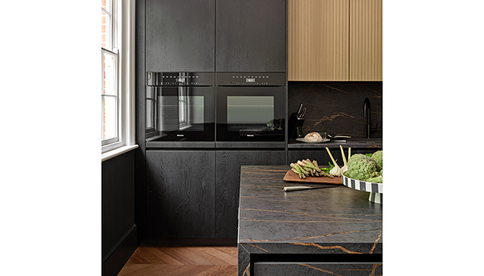
A: We used Eggersmann units in wood veneer and Eggersmann's fluted wood for wall units. We went for this range because of its flexibility and attention to detail, as well as the excellent quality. We used Miele appliances throughout – the latest models that we chose had been tried and tested on the previous project, and we went handleless and fully integrated, with no steel details to add to the overall sleekness.
Q: What materials did you use?
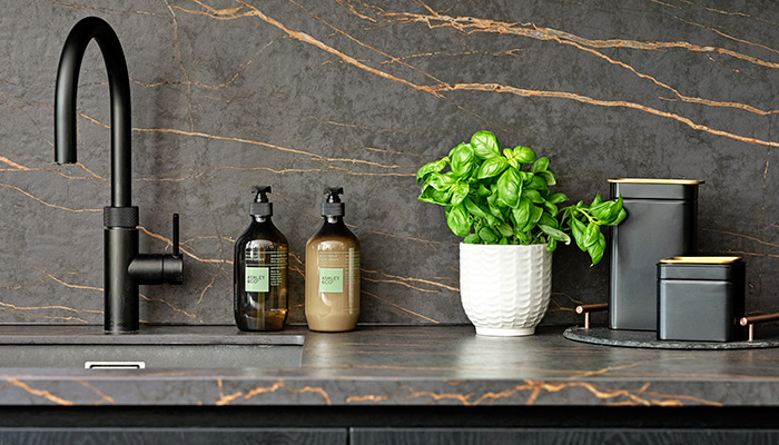
A: Although it's not an unusual material, using Dekton as a door finish was perhaps a little different. As we fitted the worktops first, Optidek was able to take the surface's veins into consideration when they supplied the fascias to give an even more seamless and monolithic look.
Q: Were there any particular challenges that you faced?
A: There were a couple of appliances that took their time to arrive, but that's something we have got used to managing as best we can... Apart from that, the kitchen was fitted during Covid, so inevitably that meant things took a little longer.
Q: What is your favourite part of the finished project?
A: I do love the island, but what really makes it stand out for me is all those finishing touches that make it a home – that's something that Rivela Interiors has a great eye for.
Q: Are there any design elements that you’re particularly proud of?
A: I really like the overall simplicity of the kitchen and like how it sits with the existing features of the room without looking out of place. Since we initially put it up the project on social media, we have had lots of interest, which makes us really proud.
Tags: kitchens, features, halcyon interiors, graham robinson, eggersmann


