Kitchen focus: Why earthy neutrals and soft greens are a growing trend
Wed 26th Jul 2023 by Sally Smith

Kitchen focus: Why earthy neutrals and soft greens are a growing trend

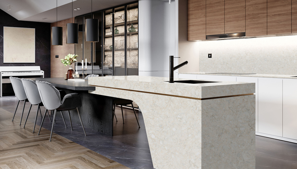
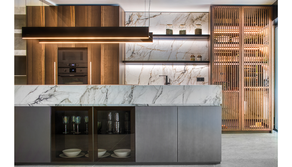
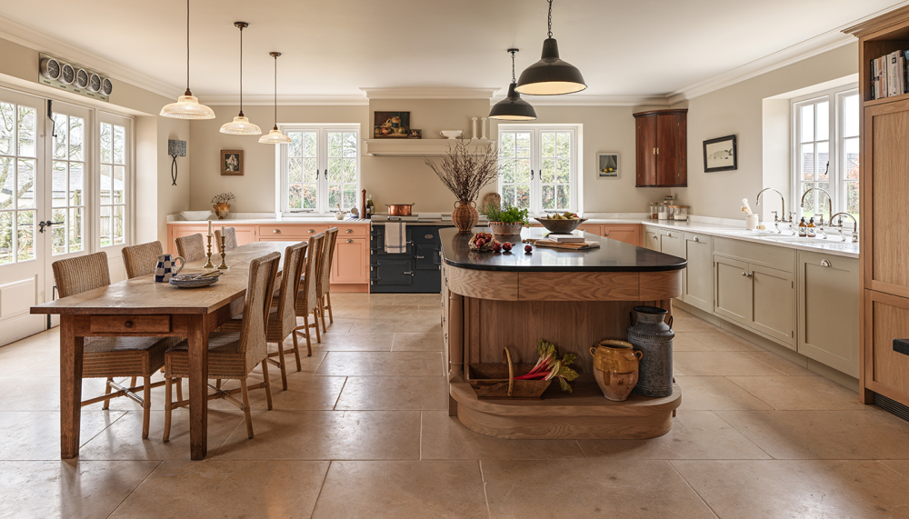
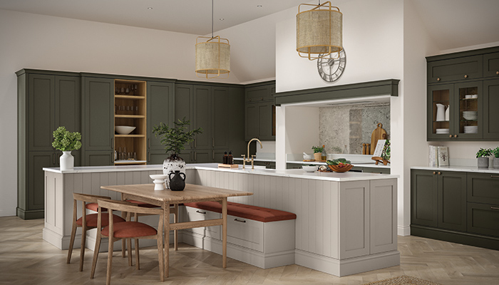
Warmer neutral tones mixed with muted botanical greens are a popular choice in kitchen design, creating the calming environment consumers are looking for – Sally Smith discovers why this trend is set to continue.
It’s not surprising the demand for nature-inspired colour palettes in the kitchen is on the rise as homeowners are craving calming spaces to escape to, as a welcome respite from their fast-paced, technology-driven lives.
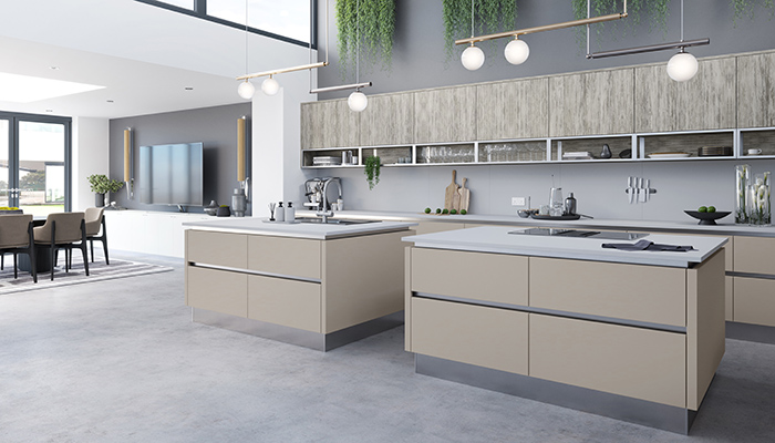
"There has been a renewed demand for a more considered kitchen, where the occupant’s lifestyle leads the layout, and nature-inspired colours, textures, and materials work harmoniously so as not to overwhelm the senses," explains Sinead Trainor, kitchen category manager at LochAnna Kitchens. "Selecting a colour for kitchen cabinetry can be daunting for customers, so opting for cabinetry in a natural colour palette offers a timeless element to the home. It will stand the test of time in comparison to more trendy hues, as well as being universally appealing for both current and future owners of the space."
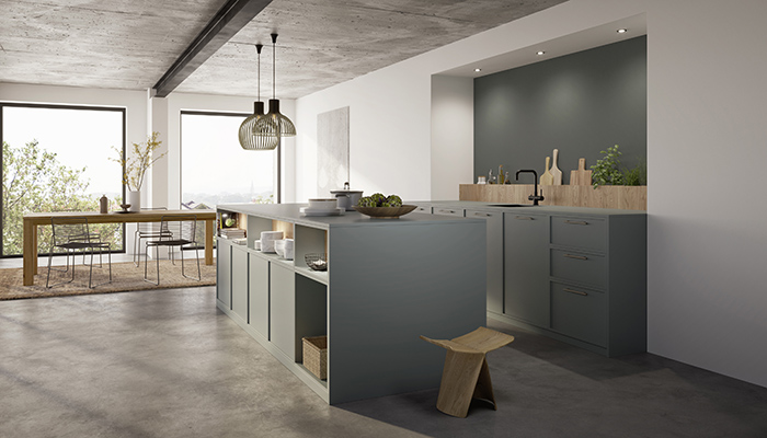
Ben Jones, Omega PLC creative lead design manager, agrees. "Warmer neutrals have a homely and inviting vibe and, as it's not an overly outlandish palette, it is considered a safe option by clients and can give customers the confidence to experiment and mix a range of tones to create a natural colour scheme," he says. Jones' advice to customers is to keep things simple. "Often the cleanest designs are the most effective – let the palette do the talking. I’d recommend using blocks of colours to differentiate elements of the design and use layers and textures to create depth of tone."
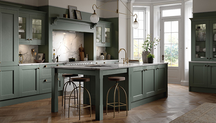
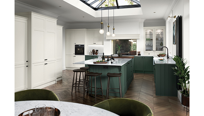
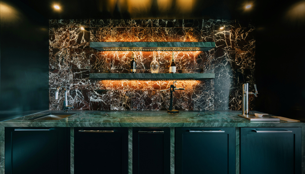
Tony McCarthy, Crown Imperial commercial director, has seen a change in customers' perception of kitchen design. "In recent years, the garden has become a relaxing haven for many people, and using complementary calming colours in the kitchen helps achieve a seamless fusion between the zones. A ‘back to nature’ kitchen scheme gives designers the opportunity to bring the outside into the kitchen, using muted earthy tones and natural wood styles."
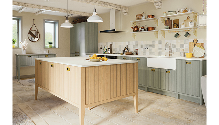
Customers are looking for holistic solutions for their interiors to help to achieve a mindful approach to living, and Matt Phillips, head of UK operations at Rotpunkt, has seen this trend gain momentum. "The botanical shades of nature with gentle grey, fresh white, and green/blue colour palettes are opening up new possibilities in the contemporary kitchen living space. Combine these colours with different types of solid and veneered wood in a range of textures from rough sawn and brushed, through to fine grain and grooved surfaces to complete the look of the scheme. Oak is the wood of choice this year. It’s a versatile wood that can take on virtually any hue like light beige, dark brown and even whitewashed, which has in turn influenced the warmer stone effects coming through in kitchen surfaces."
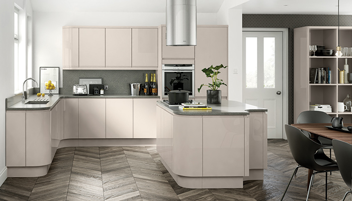
Amy Thompson, Caple furniture supervisor, believes earthy greens, warm cashmere, and soothing mussel tones create a cosy and inviting ambience that makes spending time in the kitchen a joy. "Designers and retailers can provide their customers with more options, regardless of the size and style of the kitchen, by incorporating these tones into kitchen designs. These natural, earthy and muted tones should be used to open up the space and bring the outdoors in. It is important to ensure that they do not clash or contrast with other tones in the kitchen, as this can disrupt the overall aesthetic. A natural colour palette caters to a broad spectrum of tastes and styles and is therefore likely to attract a larger customer base, leading to a potential increase in sales."
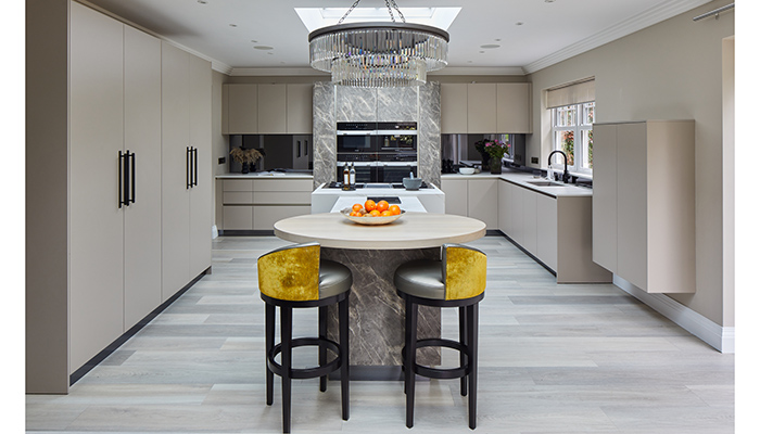
Neil Taggart, marketing manager at TKC, says: "There has long been a trend towards natural, organic colours for the kitchen because they provide a neutral and calm canvas for a design that will stand the test of time and give long-lasting enjoyment. The best-selling colours are firmly rooted in the easy living neutrals of whites, off-white and light grey because they have the design flexibility to work with so many other elements and create a range of stylish looks."
Cassie Jones, brand manager at Masterclass Kitchens, adds: "A natural colour palette appeals to a wide range of customers, and with the addition of matte finishes and natural textures will add a richness and warmth to any design. The versatility of earth-based tones easily integrates into other design trends and features within the home and, when complemented with ambient lighting, can amplify the earth tones and create a cosy atmosphere."
While these tones are highly adaptable and can work well with a wide range of materials and finishes, there are key factors for designers to keep in mind, as Shehryar Khan of Sheraton Interiors points out. "Too much of a single colour can make the space feel dull, so it's crucial to create a blend of these muted tones, adding pops of complementary colours to add depth and interest. It’s also important to remember that the choice of materials and finishes can significantly impact the overall look, so choose ones that complement the chosen colour palette," he says.
Tags: kitchens, features, neutral tones, lochanna kitchens, omega plc, crown imperial, rotpunkt, caple, tkc, masterclass kitchens, sheraton interiors


Sign up to our newsletter
Most Read