The shape of things to come – 4 ways kitchen cabinetry is evolving

KitchensFeatures Tue 14th Feb 2023 by Lisa Hibberd

The shape of things to come – 4 ways kitchen cabinetry is evolving

The shape of things to come – 4 ways kitchen cabinetry is evolving


Feature by Lisa Hibberd | Tue 14th Feb 2023

Lisa has a background in working on consumer titles, and as the former associate editor of Your Home magazine, over 15 years' experience writing about kitchens and bathrooms. She now works as a freelance, contributing to both consumer and B2B platforms. More


Kitchen cabinetry is changing, with some of the most recent innovations aimed at increasing usable space as well as improving aesthetics. Lisa Hibberd takes a look at the next generation of furniture and hears from some industry experts about 4 of the latest trends.

1. Fluted and slatted finishes
Fluted glass has been evident in kitchen designs for the past few years,” explains Charlie Smallbone, founder of Ledbury Studio. “It makes an appearance in a number of Ledbury Studio kitchens, and this decorative flourish is really having a moment right now. We’ve taken fluting to the next level by using the effect with other materials. In several of our designs, fluted wood has been used to add interest to the sides of kitchen islands.”
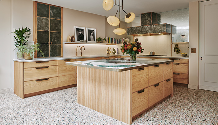
The Camden kitchen by Ledbury Studio features on-trend fluted oak detailing at either end of the island, and the Ambra quartz splashback has been fluted to match

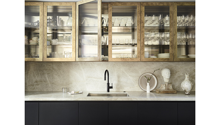
Also fitting the trend for fluted finishes is this stunning Roundhouse Urbo and Metro matt lacquer kitchen in Farrow & Ball’s 'Railings', teamed with upper cabinetry in an antique brass finish with fluted glass doors, and the Taj Mahal worktop and splashback

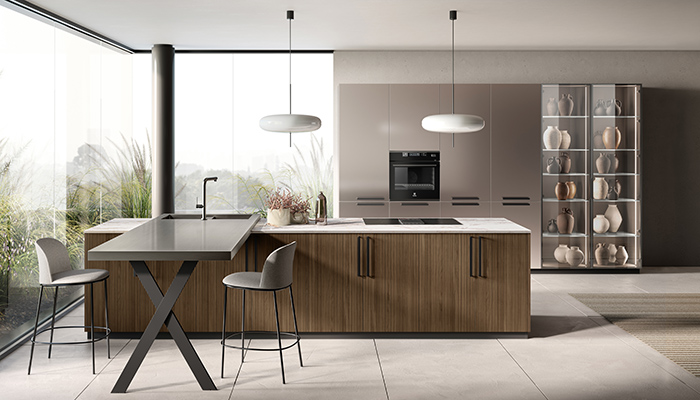
Contrasting materials characterise the recently-launched Musa kitchen by Scavolini. As is standard for a Scavolini kitchen collection, Musa is available with a wide range of cabinet fronts including both slatted and slab doors

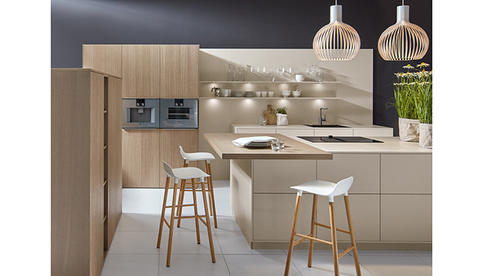
Pictured here in this contemporary kitchen design from Pronorm are two organic door finishes of Oak Trend, a premium real wood veneered door featuring a narrow-fluted design, and Angora Grey ultra-matt with its velvet soft texture and anti-fingerprint technology. The two finishes work harmoniously together to provide a modern yet homely aesthetic, while offering visual and textural contrast


2. Clever ideas for cabinet fronts
“With kitchen trends moving towards a more bespoke and individual look, the ability to complement or contrast accent finishes allows the customer to take their design to another dimension,” suggests Cassie Jones, brand manager at Masterclass Kitchens. “Choosing to clad an island entirely in stone can eat into a client’s kitchen budget but opting for high-quality laminates instead will achieve the same look at a fraction of the cost.”
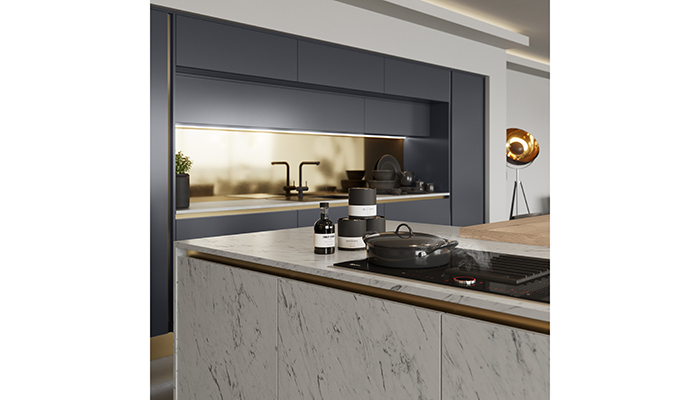
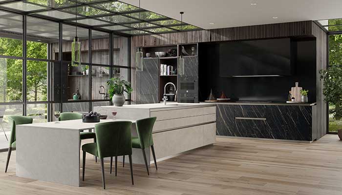
The trend for matching worktop and cabinet design is also on the up, and the H Line Milano Carrara Marble doors with matching worktop by Masterclass Kitchens is a prime example of how designers can make this look work

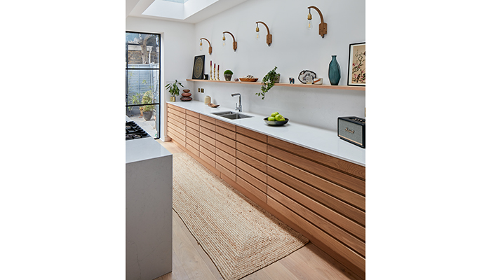
Sola Kitchens’ Mysore Road project showcases cabinets with wooden boards laid horizontally for a different take on a panelled look


3. Metallics for maximum impact
“There's nothing quite like metallics to make an interior pop,” comments Valentinos Shiatis, head of marketing at Sola Kitchens. “Opting for antique brass clad doors on kitchen cabinetry and introducing more down to earth materials like black ultra-matt laminate doors will make sure a design isn't too flashy.”
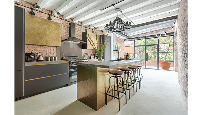
Taking metallics to a whole new level, Sola Kitchens’ Mountview project features antique brass clad doors on the kitchen cabinets alongside more down to earth materials like black ultra-matt laminate doors, alongside finishing touches such as brass inlays for the integrated handles, and industrial-style Dekton worktops

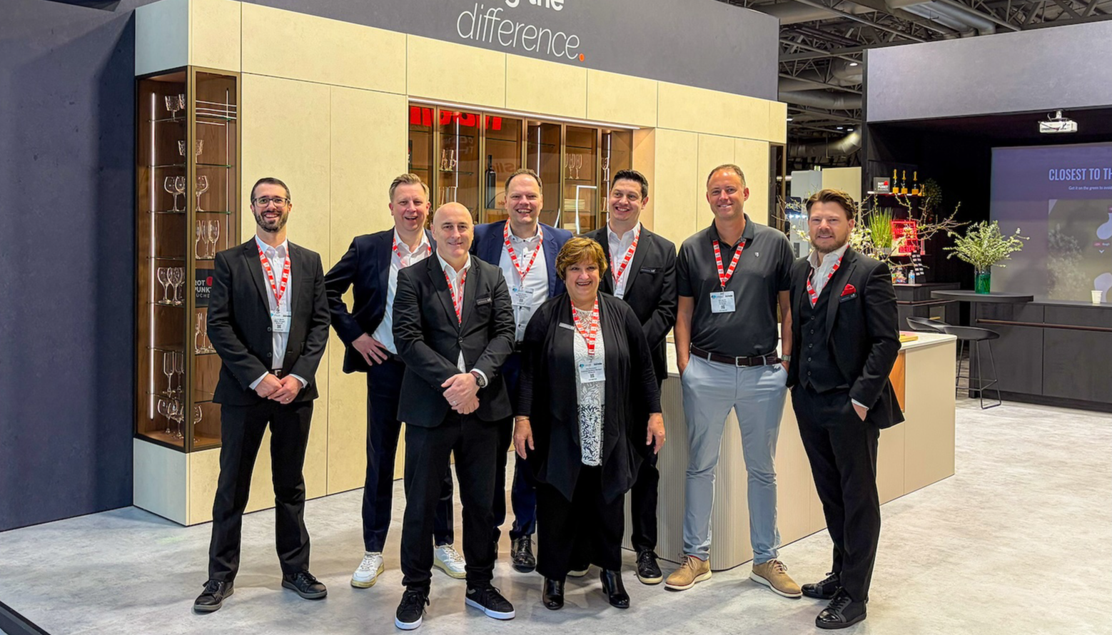
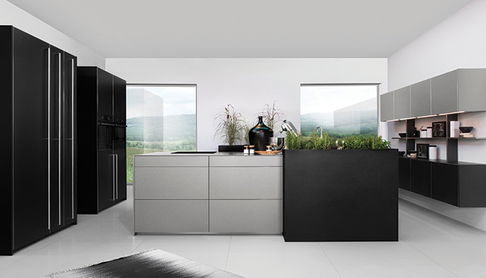
Metal Grey & Metal Black furniture cuts a striking figure across this industrial-style concept featuring Rotpunkt’s Titanium kitchen. Designers can make use of contrasting metallic tones and texture that, when faced with different strengths of light or time of day, transform again to offer a new perspective

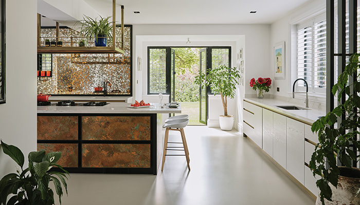
Ledbury Studio’s Poole Harbour project is the perfect example of how metallics can be used to maximum effect. It showcases both Verdigris copper panels surrounded by oak frames on the island, and tall cupboard fronts made from a liquid metal with a specialist pewter shagreen finish


3. Stealing more space
“Kitchen cabinetry should make the most of the available space within the room,” says Cassie Jones at Masterclass Kitchens. “Including ceiling height cabinets is one idea to maximise space, however getting into these cabinets can become a practical nightmare. Instead, eliminating the centre mullions within the cabinet can offer 30% more storage space in the cabinet. Large platters, serveware or casserole dishes, for example can be easily accessed without negotiating a post within the middle of the cabinet. In addition to this, bi-fold doors are a hot topic. The customer can create a unique kitchen design that not only looks magnificent but offers easier access to the contents within the cabinet with little protrusion into working and walking spaces – ideal for any tight area.”
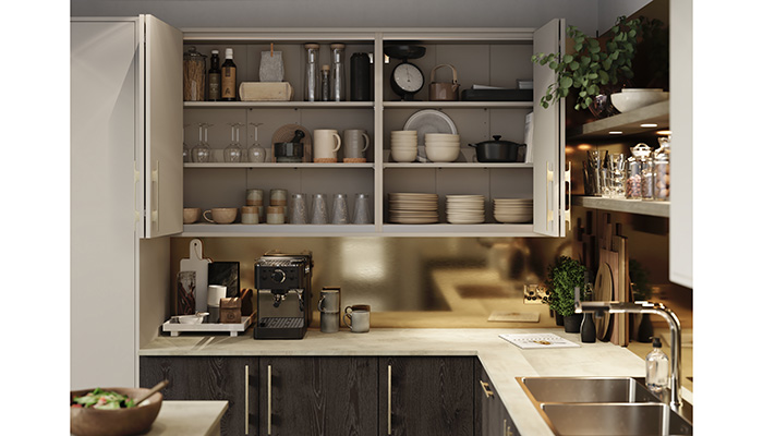
Having redesigned its complete range of cabinets, Masterclass Kitchens has eliminated the centre posts, meaning that the end user benefits from up to 30% more storage space

The Q-Line Diamante Ceramica and Tempesta Ceramica kitchen from Mereway boasts fantastic design options, while offering increased storage capabilities with its lower 60mm plinth line and choice of three widths – 1600mm, 1800mm and the super-wide 2000mm

Tags: kitchens, features, cabinets, cabinetry, ledbury studio

In other news